
Investors are all smiles with less than a week to go before 2025 comes to a close -- and with good reason. As of the closing bell on Dec. 19, the iconic Dow Jones Industrial Average (^DJI +0.38%), benchmark S&P 500 (^GSPC +0.88%), and growth stock-dependent Nasdaq Composite (^IXIC +1.31%) have risen by 14%, 16%, and 20%, respectively, year-to-date.
Catalysts have been aplenty on Wall Street, with next-big-thing trends, such as the rise of artificial intelligence and the emergence of quantum computing, leading the way. The expectation of additional rate-cutting from the Federal Reserve has provided more fuel for the bull market’s fire.
You could almost say things have been too good to be true for the stock market -- and that’s usually bad news for investors.

Image source: Getty Images.
According to two historically flawless indicators, there’s a heightened probability of a stock market crash in the new year.
These valuation tools have a 100% success rate of foreshadowing downside in stocks
Before digging in, let me clarify that no single data point, ratio, or correlated event can guarantee the short-term directional movement of any specific stock or major market index. Nonetheless, some of these correlations have an excellent, or even flawless, track record of forecasting future directional movements on Wall Street.
The first valuation tool that has an immaculate track record of forecasting the future (with one limitation that I’ll get to in a moment) is the S&P 500’s Shiller Price-to-Earnings (P/E) Ratio, which is also referred to as the cyclically adjusted P/E Ratio, or CAPE Ratio.
When most investors evaluate a stock, they turn to the time-tested P/E ratio. The P/E ratio is arrived at by dividing a company’s share price by its trailing 12-month earnings per share (EPS). However, the P/E ratio can easily get tripped up by recessions.
Meanwhile, the Shiller P/E is based on average inflation-adjusted EPS over the previous 10 years. Recessions are unable to meaningfully skew the Shiller P/E multiple.
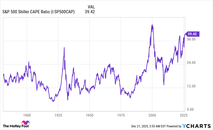
S&P 500 Shiller CAPE Ratio data by YCharts.
When back-tested to January 1871, the Shiller P/E has averaged a multiple of roughly 17.3. But as of the closing bell on Dec. 19, the Shiller P/E clocked in at a multiple of 40.15. This is the second priciest stock market in history, dating back 155 years!
Over these 155 years, the S&P 500’s Shiller P/E has topped 30 on six occasions, including the present. Following the previous five occurrences, the Dow Jones Industrial Average, S&P 500, and/or Nasdaq Composite went on to lose 20% to 89% of their respective value. Although the Shiller P/E Ratio doesn’t help determine when the music will stop (this is its aforementioned limitation), it has flawlessly foreshadowed some sizable bear markets and stock market crashes.
But this isn’t the only measure of value that’s received a perfect mark. The market-cap-to-GDP ratio also has an immaculate track record of portending trouble for Wall Street.
In a 2001 interview with Fortune magazine, the soon-to-be-retiring billionaire mastermind of Berkshire Hathaway, Warren Buffett, proclaimed the market-cap-to-GDP ratio to be “probably the best single measure of where valuations stand at any given moment.” That’s why this ratio is affably referred to as the Buffett indicator.
Warren Buffett Indicator hits a new all-time high of 223%, the most expensive stock market valuation in history 🚨🚨 pic.twitter.com/p14CI3VXGu
— Barchart (@Barchart) October 26, 2025
The Buffett indicator adds up the market value of all publicly traded companies in America and divides this figure by U.S. gross domestic product (GDP). This ratio has averaged approximately 85%, dating back to 1970. This is to say that the aggregate value of U.S. public companies has equaled 85% of U.S. GDP, with a lower percentage signifying that stocks are attractively priced.
On Dec. 10, the Buffett indicator hit an all-time high of 226.26%, representing a 166% premium to the 55-year average. There’s a reason the Oracle of Omaha has been a net seller of stocks, to the cumulative tune of $184 billion, for 12 consecutive quarters.
When the Buffett indicator moves well beyond its previous all-time high, history shows that double-digit declines for Wall Street’s major stock indexes soon follow.
Both the S&P 500’s Shiller P/E and the Buffett indicator point to the very real possibility of a stock market crash in 2026, albeit nothing is guaranteed.

Image source: Getty Images.
History is a pendulum that swings in both directions and strongly favors optimists
With the new year often being a time for joy and reflection, the last thing investors probably want to think about is the prospect of a stock market crash. Thankfully, history is a pendulum that swings in both directions and has, more often than not, favored optimistic, long-term-minded investors.
Although this is a painful admission for some investors, stock market corrections, bear markets, and even crashes are normal and healthy events for Wall Street. No amount of fiscal stimulus or monetary policy changes can thwart these often emotion-driven downturns.
But there is a silver lining amid the possibility of an elevator-down move for the Dow Jones Industrial Average, S&P 500, and Nasdaq Composite in the new year. Taking a step back reveals a significant disparity in stock market cycles.
In June 2023, shortly after the S&P 500 was confirmed to be a new bull market, the researchers at Bespoke Investment Group published a data set on X (formerly Twitter) that compared the length of every S&P 500 bull and bear market between the start of the Great Depression (September 1929) and what was then the present day.
It's official. A new bull market is confirmed.
— Bespoke (@bespokeinvest) June 8, 2023
The S&P 500 is now up 20% from its 10/12/22 closing low. The prior bear market saw the index fall 25.4% over 282 days.
Read more at https://t.co/H4p1RcpfIn. pic.twitter.com/tnRz1wdonp
On one end of the spectrum, Bespoke revealed that the average S&P 500 bear market decline lasted just 286 calendar days, or approximately 9.5 months. Additionally, only eight out of the 27 bear markets examined reached the one-year mark.
In comparison, the typical S&P 500 bull market persisted for 1,011 calendar days, which is roughly 3.5 times longer than the average bear market. Including the current bull market (when extrapolated to the present day), 14 out of 27 S&P 500 bull markets have lasted longer than the lengthiest bear market, which endured for 630 calendar days.
Even though stock market corrections, bear markets, and crashes are inevitable, they’ve always represented a surefire buying opportunity for investors who maintain perspective and remain optimistic. If history were to rhyme in 2026, based on what the two historically flawless valuation tools foreshadow, it’ll mark an ideal opportunity for investors to snag amazing deals in high-quality businesses.
